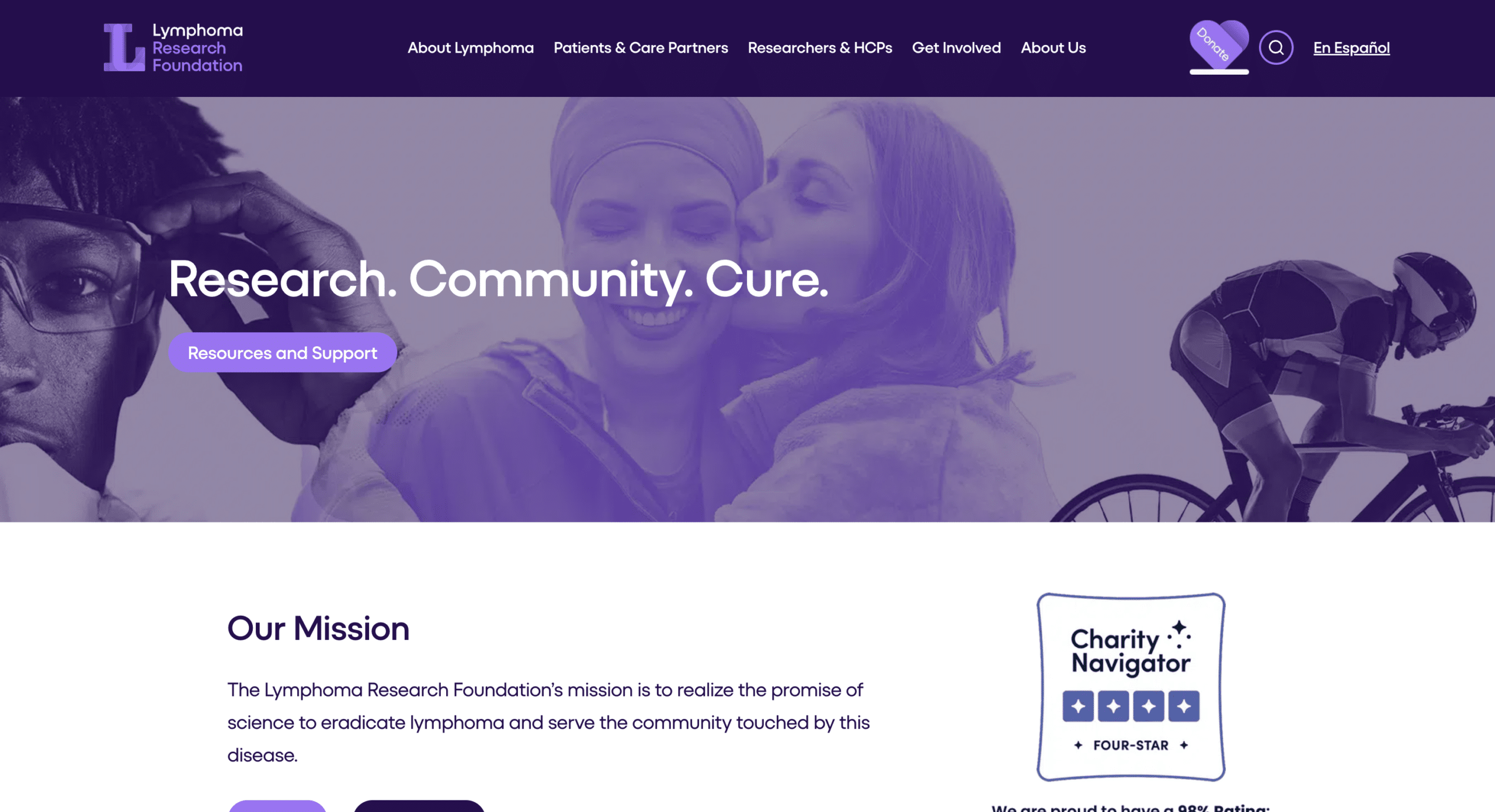
We’ve worked with the LRF team on a number of projects for their site, including building out an interactive story section to celebrate their 25th anniversary, designing and launching all new email templates, upgrading their peer-to-peer(P2P)fundraising program, and a total website refresh involving migrating their incredible backlog of content from their previous JupiterX theme to a new custom Wordpress site.
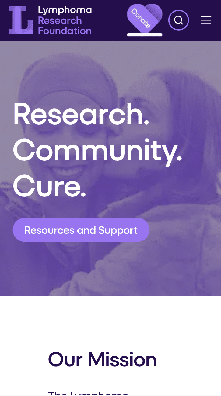
The LRF team knows the power of updating services and systems on a site, and that’s why we were so excited to implement their new logo and color palette to debut as a part of their recent rebranding effort. They wanted to stand out against other lymphoma and blood-based disease organizations, choosing to go with a purple color palette instead, with more rounded, softer iconography to create a cohesive sense of community and hope.
The catch? A super short timeline, with only around a month until their unveiling when we began our work. But we were up to the challenge.
We hit the ground running by updating the global styling across the site, ensuring that each building block and element reflected the new colors and branding rules. After these changes, we performed specific checks on key pages to review and make more targeted branding updates. But our work wasn’t done yet. Following the new branding rollout, we completed an end to end quality assurance process to ensure that the branding across the site was consistent.
Through close collaboration, we successfully helped the LRF team bring their refreshed brand to life within a tight timeline. With our targeted updates and thorough quality assurance process, we ensured a seamless transition between their old and new branding. We’re looking forward to seeing how their new look continues to inspire hope and progress in the fight against lymphoma.


